 |
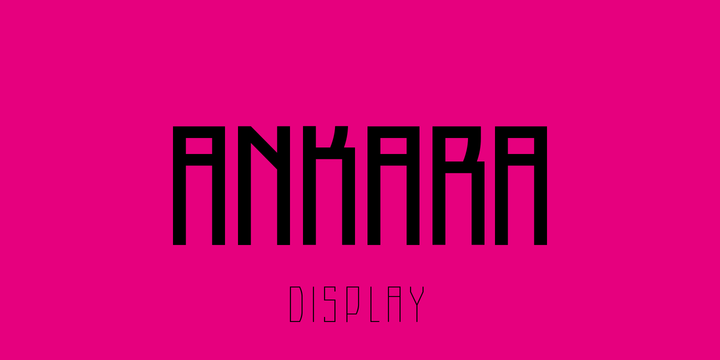
Ankara is a display font that inspired by the forms of high windows, doors and gates of buildings that constructed in the early years of Turkish Republic.
 |
Ankara is a display font that inspired by the forms of high windows, doors and gates of buildings that constructed in the early years of Turkish Republic.
 |
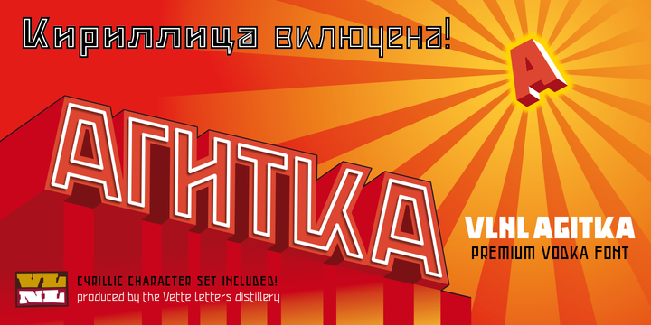
As a font designer for films Henning Brehm delivers fonts with a whip-sharp eye for precision. His latest Vette Letters release, VLNL Agitka is a Cyrillic-inspired (and including) alphabet with both feet rooted in Soviet Union-era propaganda posters. Its design is constructivist (look Mom, no curves!) geometric and strong. Like Russian vodka. Aside from the Regular, Light, Bold and Black weights, Agitka comes in four Neon styles as well. For a dazzling design effect, layer those neons over a regular weight for a star struck embossed-letter effect.
We would also like to point out the usage of VLNL Agitka in the Bourne Ultimatum movie, for which Brehm designed neon signage for a scene at a Russian supermarket. За здоровье – Za Zdarovje!

We present Woop a creative magazine templates for bloggers who love to blog on food, fashion, travel and for personal blog.
Enter your email address below to subscribe to our newsletter.