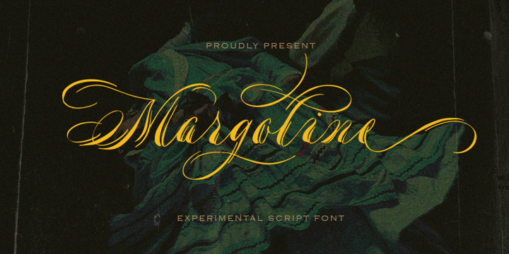
Margoline


Introducing, Margoline script font. Margoline is a swash handwritten font that is perfect for branding, packaging, wedding invitation, card, etc.


Features :


  • uppercase & lowercase
  • numbers and punctuation
  • multilingual
  • alternates and ligatures
  • swash
  • PUA encoded


We highly recommend using a program that supports OpenType features and Glyphs panels like many of Adobe apps and Corel Draw, so you can see and access all Glyph variations.
Margoline


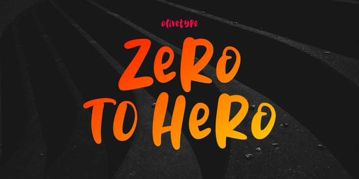
Zero To Hero


Zero To Hero is a bold handwritten font, carefully handcrafted to become a true favorite. Its casual charm makes it appear wonderfully down-to-earth, readable, and ultimately, incredibly versatile. Zero To Hero will look outstanding in any context, whether it’s being used on busy backgrounds or as a standalone headline!


This font is supporting Multi-Languages, which includes: Afrikaans Albanian Catalan Danish Dutch English Estonian Finnish French German Italian Norwegian Portuguese Spanish Swedish Zulu.


You will get : Zero To Hero OTF


Thank you


Zero To Hero


Gladies


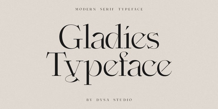
Gladies is a New Modern Serif Typeface. This another collection of Serif is perfect for your next branding project, excellent for your business. Gladies have a smooth edges, so this font gives an authentic handcrafted feel style.


Gladies is perfect choice for people looking for clean, modern, minimalist, elegant, beauty design styles. Suitable for almost any graphic designs such as logo, branding materials, business cards, gift cards, t-shirt, cover, thumbnail, print, poster, photography, quotes .etc


Gladies


Plethora


A few years ago I've discovered the work of one of the most prolific typeface designers of the Bruce type Foundry in NYC during late nineteenth century. Browsing Julius Herriet's work I found a very unique kind of ligatures in his patented "Old Style Ornamented" type design. Some letters were designed with a little top tail that allowed them to connect to each other. After that, I found that he also designed a single italic weight of the same font 7 years later. 


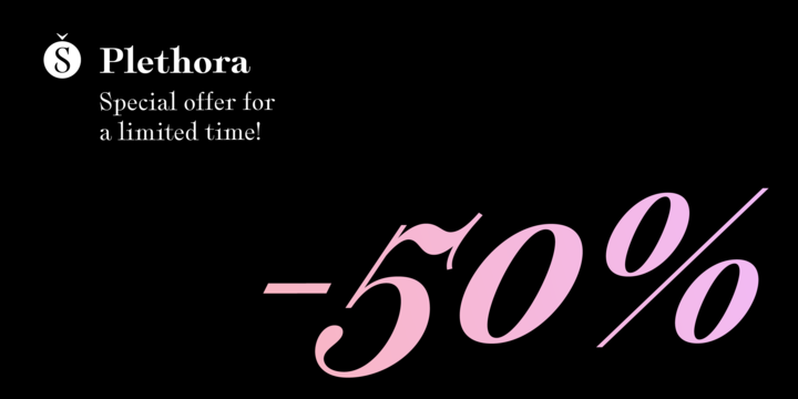
Since the beginning of the Opentype days I’ve been deeply obsessed with exploring different ways to build ligatures, so that lead me up to this point where I felt the need to create “Plethora”, this new font inspired by Herriet’s work. Extrapolating weights, adding variable technology and playing with additional interconnected letters and alternates. Definitely, Plethora means a large or excessive amount of something, and this font tries to bring back this abundance of details two centuries later. Available in 9 weights, from roman to italic, and also as variable format, “Plethora” supports plenty of latin languages and is a perfect choice for today’s design tides.


Plethora


Speeday


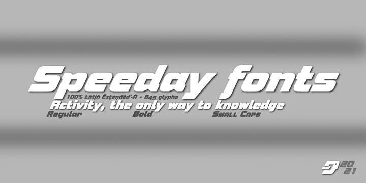
Speeday is a Display and Sans Serif typeface family, slanted at 23 ° with a rounded finish, with 3 styles, Regular, Bold and Small Caps that include 9 sets of numbers, 3 sets of uppercase and alternate letters, as well as advanced Open functions Type.


Thick typography with a contemporary appearance that brings great dynamism to the texts written with it, its use in graphic, editorial and advertising design guarantees originality, difference and maximum readability, the kerning has been carefully configured in all versions.


See specimen in PDF


Speeday


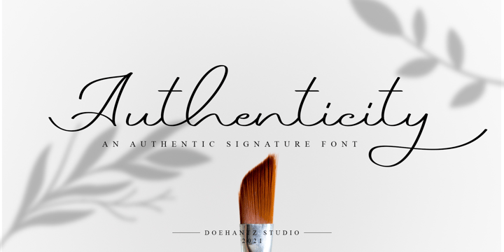
Authenticity


Authenticity is an authentic signature font. It made with a neat touch making it easy to read. This font is suitable for use as web logos, signatures, invitation, prints, headers, magazines, book covers, t-shirt prints, craft, product brand, business card, logo, and gift card


Authenticity


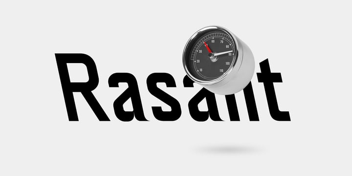
Neue Rasant


→ neue Rasant is an interpretation of a typeface used by the Singapore Land Transit Authority for its directional signage. The typeface design is based on a rigid grid with little to no room for optical compensations or any kind of harmonisation whatsoever. This approach can be seen as epitomic to an engineer’s way of designing which offers paradoxically unorthodox solutions in a seemingly orthodox system.

→ neue Rasant is a uniwidth design which means that the individual characters are occupying the same amount of space across all weights and styles. This way of designing a type family turns out handy if one wants to avoid unintentional line breaks or space consumption.

→ neue Rasant comes in five weights ranging from Thin to Bold. For the Italics the designer has the choice between 

a traditional slant to the right or an unconventional slant to the left. All weights and styles are equipped with arrows matching the individual weight’s stroke thickness.

→ For trial and variable fonts reach out to hi@neuefoundry.com


Neue Rasant